The Fluid Layout or Responsive Web Design is a technology that gives a step forward in the web revolution. It turns a website into a responsive behaviour by adapting it to different screen sizes. A mobile version website is an old fashion technique and very limited, it doesn’t adapt easily to all screen sizes. A responsive web design uses the bootstrap technology to be make this possible.
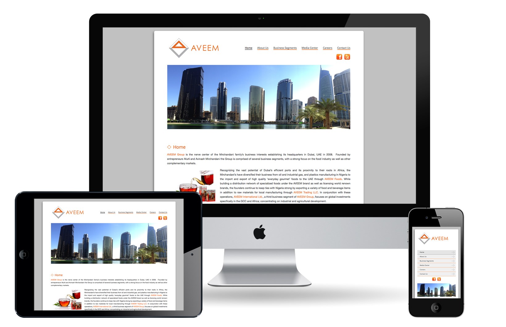
Below you may find an example of how the same website will be displayed on a Desktop, a Tablet and a Smartphone.
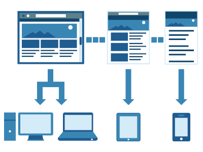
A normal website presented in a regular desktop or a desktop screen.
The same website but adapted to a tablet in portrait mode.
The same website adapted to a small smartphone screen. It turns any website into a great user-friendly experience.
Get a quotation for your responsive website quotation today!
Responsive Design Portfolio
(click to zoom in)

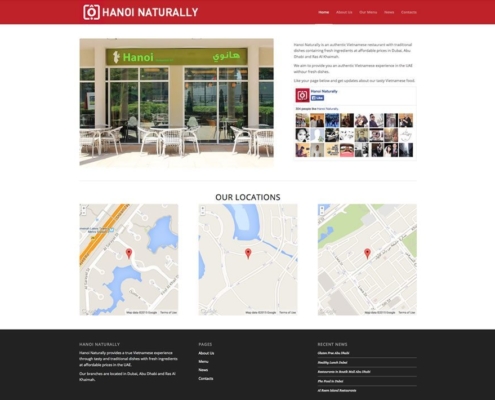
Hanoi Naturally

GrowIT Solutions
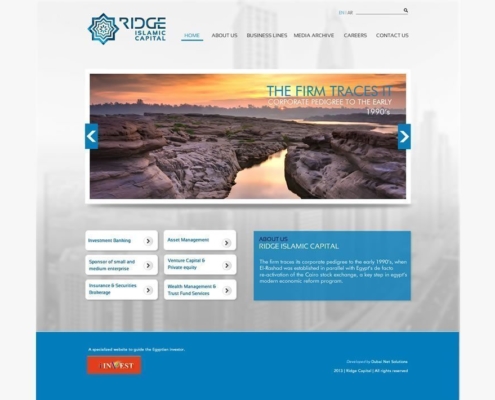
Ridge Capital Holding
RPCB
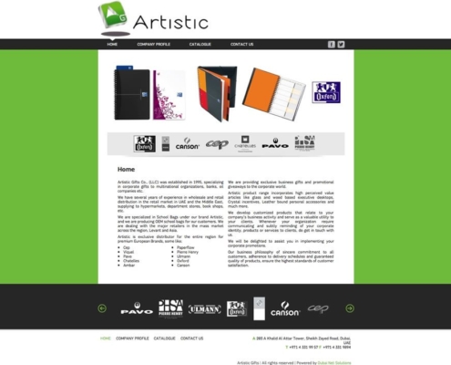
Artistic Gifts
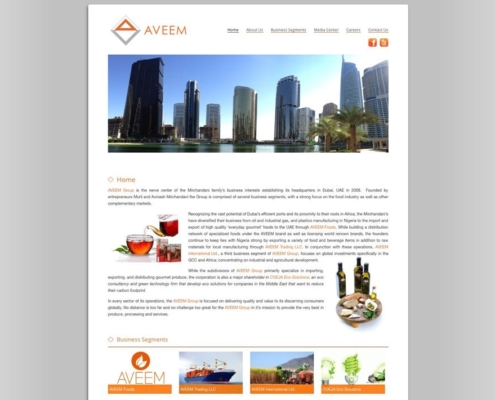
Aveem Corporate
